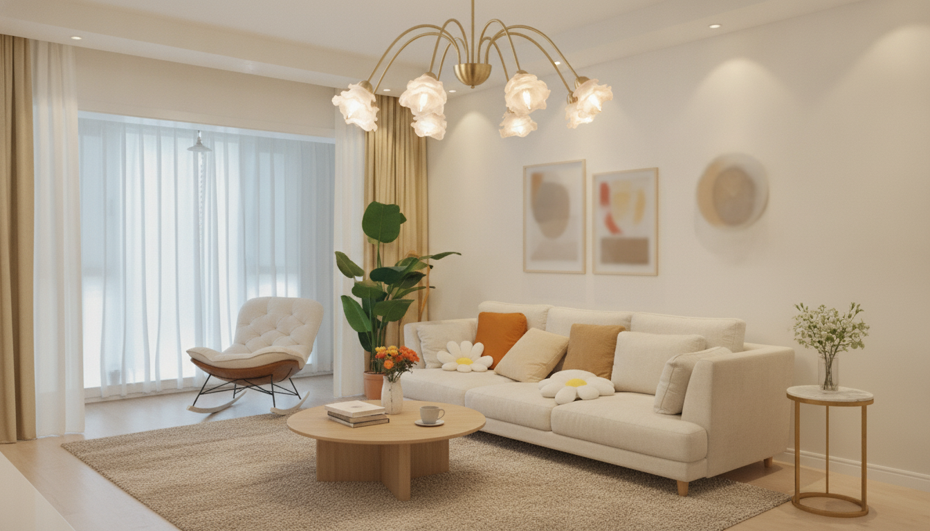
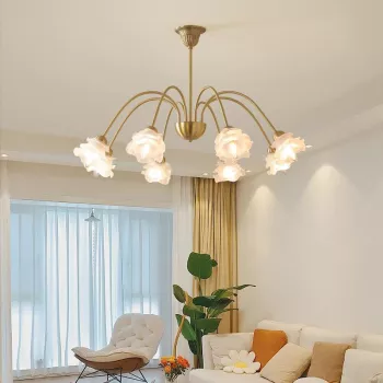
A sculptural pendant can define an entire room, and a copper rose chandelier does it with warmth, shine, and an artful floral silhouette. Copper brings a soft, reflective glow that feels elevated without turning a living room into a formal space. The rose-inspired profile adds a gentle, organic note—perfect for balancing clean-lined furniture, structured layouts, and modern finishes. Below are practical ways to style, place, size, and maintain a copper-toned chandelier so it keeps its luster for years.
What makes a copper rose chandelier feel luxurious
Luxury lighting usually comes down to three things: how it reflects light, how it holds visual attention, and how naturally it integrates into the room’s “everyday” function.
- Warm, reflective metal: Copper-toned finishes catch daylight and lamplight alike, adding depth that reads upscale—especially in the evening when the room shifts into softer ambience.
- Floral-inspired silhouette: Rose-like forms soften modern geometry, giving a balanced look: contemporary structure with an organic focal point.
- Upward visual pull: A pendant-style chandelier draws the eye upward, boosting perceived ceiling height and creating a true centerpiece over seating zones.
- Plays well with layered lighting: In a layered plan (ambient + task + accent), the chandelier becomes the statement glow while lamps and sconces handle comfort and function.
Design pairings for living spaces
Copper is versatile because it can read modern, glam, or classic depending on what surrounds it.
- Modern minimal: Pair copper with matte whites, pale woods, and clean-lined furniture so the chandelier acts as the main sculpture.
- Soft glam: Echo warm metal tones with velvet, curved sofas, mirrored accents, and neutral rugs for a hotel-lounge mood.
- Contemporary classic: Copper looks refined with walnut, cream upholstery, and subtle molding—polished rather than trendy.
- Color notes: Copper looks strongest against deep greens, charcoal, warm taupes, and off-whites. If maximum warmth is the goal, limit overly cool grays and stark blue undertones.
Placement ideas that look intentional
Placement is what turns a chandelier from “pretty fixture” into “designed moment.” Start with the room’s focal activity—conversation, lounging, or reading—and let that guide the location.
Sizing and hanging height
Quick planning guide for a living-room chandelier
| Room feature |
What to consider |
Practical tip |
| Ceiling height |
Determines drop length and visual scale |
Higher ceilings can handle longer drops; standard ceilings often look best with a tighter silhouette |
| Seating layout |
Chandelier should relate to the conversation area |
Center it over the coffee table or the midpoint of the seating group |
| Traffic flow |
Avoid low hanging fixtures in walkways |
Keep the lowest point higher in paths than over tables |
| Finish coordination |
Copper should connect to other warm notes |
Repeat the tone in a mirror frame, side table detail, or hardware |
Light quality and bulb choices
- Choose warm-white light: For living spaces, warm-white illumination typically flatters copper best and makes rose-like details appear richer.
- Add a dimmer: Dimming helps the chandelier transition from daytime clarity to evening ambience without needing multiple fixtures.
- Prioritize color quality: If using LED bulbs, look for high color quality so skin tones, wood, and textiles look natural under the light. For LED guidance, the U.S. Department of Energy offers a helpful overview: LED lighting basics.
- Layer with lamps: Pair the chandelier with table or floor lamps to soften shadows and make the room feel relaxed instead of overly “lit from above.”
Installation notes to plan ahead
- Ceiling box and support: Make sure the electrical box and mounting hardware are rated for the fixture’s weight; heavier chandeliers may need additional bracing.
- Placement check: Mark the center point from multiple reference lines (sofa midpoint, coffee table alignment, and ceiling joists) before drilling.
- Switching: A dimmer creates flexible “scenes” for entertaining, movie nights, and everyday lounging.
- When to hire a pro: Professional help is recommended if wiring is older, the fixture is heavy, or reinforcement is required. For broader planning fundamentals, visit the American Lighting Association.
Keeping a copper-toned finish looking its best
Product spotlight: Modern Copper Rose Chandelier
If you want a statement pendant that brings warm copper glow and floral-inspired elegance to a living room, the Modern Copper Rose Chandelier – Luxury Pendant Light for Living Spaces is designed for that centerpiece role. It works best where it can be visually centered—over a coffee table, the main seating arrangement, or a defined lounge zone—so the rose-like silhouette reads clearly from multiple angles.
Also in stock
FAQ
Is a copper chandelier too warm-toned for a modern living room?
No—copper can read very modern when it’s paired with clean lines, uncluttered surfaces, and simple materials like matte white, pale wood, or black accents. Keeping surrounding décor minimal helps the copper finish look intentional rather than overly traditional.
How high should a chandelier hang in a living room?
It depends on what’s beneath it: over a coffee table it can hang lower for intimacy, but over walkways it should sit higher to maintain comfortable clearance. Aim for a proportional “drop” that centers on the seating area without interrupting movement through the room.
Can LED bulbs be used in a luxury pendant chandelier?
Yes, LED bulbs are commonly used in luxury fixtures as long as the bulb type matches the socket and the fixture’s rating. For the best ambience, choose warm-white, high color quality LEDs and pair them with a compatible dimmer.
Recommended for you


Leave a comment